Back when movie posters were artwork
In today’s world, excitement builds for a new film once the movie trailer is released.
Sometimes it’s shared virally on social media. Other times the trailer is first released during the commercials of a big TV event like the Super Bowl or Final Four. They even tease when the trailer will be released days ahead of time.
But movie trailers didn’t use to be the main way people knew about upcoming movies.
Trailers didn’t always air as TV commercials or even before other movies at the theater.
There was no Internet and therefore no movie news Web sites like this one.
How did people know about a new movie? Posters.
Besides the large marquees outside of grand movie theaters, the posters outside were some of the main advertising for movies decades ago.
And they were much better looking than the Photoshopped-to-death posters we see nowadays.
Movie posters were painted by artists and many looked awesome. They had to portray key scenes from the movie and give you a sense of what it’s about in a few images.
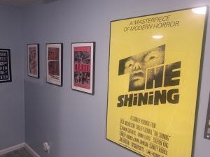
I collect framed versions of beautiful looking movie posters and I keep them in my movie room. I focus quite a bit on the look of the poster and some movies that are some of my all-time favorites are not hung on my walls since the posters are only so-so.
In fact, most of my framed movie posters are prints from the greatest movie poster designer of all time: Saul Bass.
Saul Bass was a graphic designer in the ‘50s, ‘60s and ‘70s. He designed the logos for such famous companies as AT&T, Quaker Oats, the United Way and United Airlines. He designed opening title sequences for movies too. He designed the animated paper cut-out of a heroin addict's arm for Otto Preminger's The Man with the Golden Arm, the credits racing up and down that become a high-angle shot of a skyscraper in Hitchcock's North by Northwest, and the disjointed text that races together and apart in Psycho.
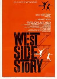
The posters he designed include The Shining, West Side Story, Vertigo, Schindler’s List, It’s a Mad, Mad, Mad, Mad World, Anatomy of a Murder, The Magnificent Seven, Exodus and many more.
Here are some examples:

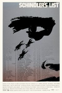
His posters were special because they looked like works of art. He liked strong angles and line and bright primary colors like yellow and red. He didn’t use likenesses of the stars of use quotes from the movies. He didn’t put the actors’ names in insanely large type. He tried to thematically represent the movie in a thematic way.
For Vertigo, he uses a spiral that represents the man’s descent, both literally and mentally. It draws you in and disorients you.
For Anatomy of a Murder, he shows the body broken apart, lying on the floor dead. A play on words of sorts. It also captures the moral ambiguities of this film.
The Shining is one of his best posters and surprisingly enough Bass didn’t get along with director Stanley Kubrick. This is surprising since they’re too Jewish boys from The Bronx but Kubrick thought Bass emphasized the supernatural elements of the book in his design on the posters. Famously, Kubrick’s interpretation of Stephen King’s novel downplayed the supernatural elements of the source material. The compromise they landed on was a face peering out of the “t” in The Shining, a nod to the “Here’s Johnny” scene where Jack Nicholson puts an axe throw a door and then looks through with his face. Bass still makes the face on the poster look ghost-like to represent the supernatural aspect of the film/novel.

There are plenty of other graphic designers who have done some awesome work but personally I think Saul Bass is the best
In fact, check out some images from my basement.

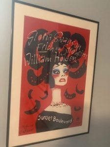
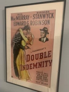


The art of movie posters is dying. The biggest example? Marvel Studios — which has the highest grossing movies every year — has lousy posters. Just bad photoshop that have no connection to the movie itself. They know people will rush to see the movie. Why bother?
Here's the perfect example.


