Collector's Corner: Minimal Prints
From the vinyl loving, movie-obsessed mind that brought you Film on Vinyl comes Collector’s Corner. This column delves deeper into the world of movie-themed toys, posters, collectibles and other oddball memorabilia to feed your inner geek. Next up on the shelf: Minimal Prints.

Long before the days of viral marketing, TV spots and the Internet itself, studios only had two ways to preview their coming attractions — trailers and movie posters. Looking at various movie posters has always been one of my favorite pastimes, and while the era of hand-drawn, Drew Struzan-esque posters has largely passed, there are still a few people out there who understand the power of the poster.
For the inaugural article of Collector’s Corner, I wanted to spotlight a fantastic business, Minimal Prints, and David Peacock, the artist behind the scenes. In 2011, David set out to create something unique. He wanted to find a way of displaying his passion for cinema without having his home resemble a college dorm room, but even the power of the Internet couldn’t bring David what he wanted, so he decided to take matter into his own hands.
David is an incredible artist, and while his prints are definitely aptly named, it doesn’t mean that they’re any less powerful than the originals. What I like most about his pieces is the way that David strips each film down to the bones to create an image that truly captures the essence of that particular film. Sure, not every poster is going to appeal to every person, but more often than not, Mr. Peacock hits the nail on the head.

The Goonies
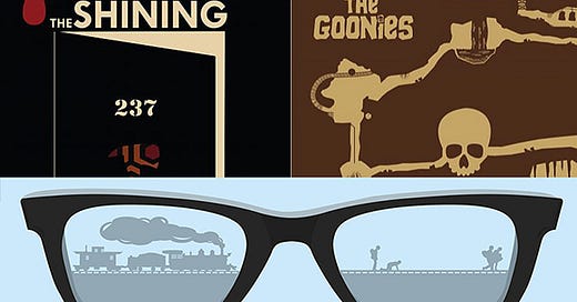
The first poster up is one of my childhood favorites, “The Goonies.” This family film brought together a ragtag team of misfits, and helped them burrow their way into all of our hearts. By now everyone knows that “The Goonies” follows the group of lovable outcasts on their search for a long-lost treasure in hopes of saving their houses.
What I love about this poster in particular is that fact that it’s a map of the movie itself. You can see below that the house sits at the top of the hill, and as you move down towards the bottom you’re taken on the same journey traveled by Mikey and company.

Stand By Me
There’s no other movie that truly captures the essence of innocence and how easily it can be lost. It’s arguably one of the best Stephen King film adaptations, and boosted the careers of some of the hottest young talent from the '80s. While there are many recognizable scenes from this film, none is as iconic as the boys on the railroad track.
David perfectly recreates the remarkable moment and makes it the focal point of his piece. Framed in Corey Feldman’s Teddy DuChamp’s glasses, you can see the boys through the right frame running for their lives while the train is speeding across the tracks on the left. What I like most about this poster is the touch of DuChamp’s glasses. It’s a great visual representation of this film where an author is looking back on a moment in his life, and how these glasses are the windows to the past.

The Shining
Saving the best for last is a much more frightening Stephen King adaptation, “The Shining.” Many consider Stanley Kubrick’s film a cinematic masterpiece, and the film showcased one of the greatest performances in cinematic history. So it’s a pretty ballsy move to set out to create a poster for such a beloved film. Luckily, David pulls it off to near-perfection.
What I love most about the print is the focus on Room 237, and the inclusion of several iconic features: the carpet, Jack’s axe and the blood from the elevator. Everything works about this print, minus the blood on the top of the print. It’s by no means a deal breaker, but for me it subtracts from the overall simplicity of the poster.
Until next time. May your boxes forever be sealed, and your posters uncreased.
[gallery ids="59999,60000,60001,60002,60003,60007,60004,60006,60005,60008,60009,60012,60011,60010"]


