Marketing Breakdown: Best and Worst of the Summer
Now that the summer is over, cinematically speaking, let's take a look back at the posters it offered — the good, the bad, and the ugly.
The Top 5 Best Posters
1. "Captain America: The First Avenger"

Unfortunately, the best poster of the summer didn't grace the walls of movie theaters. It lives exclusively online, in the homes of the film's cast and crew and with the lucky winners of a giveaway at the Hero Complex Film Festival. Matching the movie's retro aesthetic and patriotic exuberance, this poster is a perfect embodiment of the film itself. With its "Casablanca"-style design, it is also evidence that the heart of Old Hollywood is still beating. And if you're a comic-book nerd like me, you'll appreciate the Stan Lee reference near the bottom — a nod to one of his best-selling comic-books, "Sgt. Fury and His Howling Commandos," which Lee created to fulfill a bet that he could make a successful comic book with a bad title. Last, but not least, this poster has Captain America punching Hitler, a reference to the first issue of the "Captain America" comic book.
2. "Rise of the Planet of the Apes"
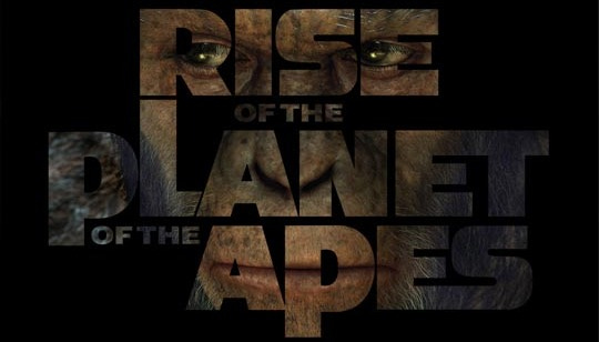
In my last "Marketing Breakdown" column, I wrote, "This simple, unsettling image perfectly summarizes the film. The movie’s tone is evident in the ape’s cold, fiercely focused eyes. And the central figure and title are initially difficult to see, which draws you closer to the poster and makes it all the more eerie. At once murky, ambiguous and perfectly clear, this is one of the summer’s riskiest — and therefore most effective — posters." I stand by those sentiments.
3. "The Devil's Double"
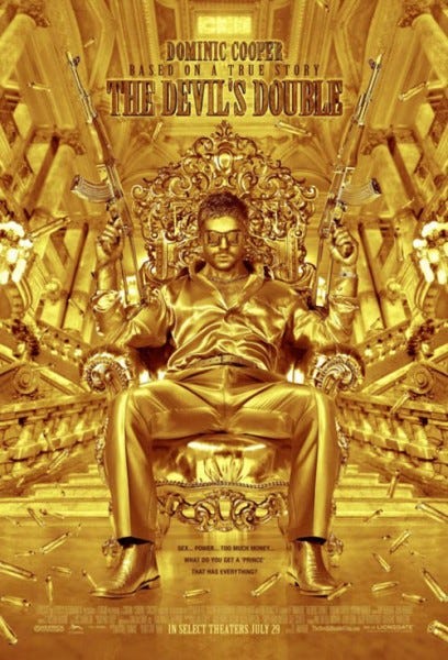
I didn't see the film, but I love the poster. It's a startling, arresting, flamboyant image reminiscent of a vintage James Bond poster, only scarier. And it seems to perfectly match the movie's tone, which is like that of an operatic gangster film in the vein of Brian De Palma's "Scarface."
4. "Super 8"
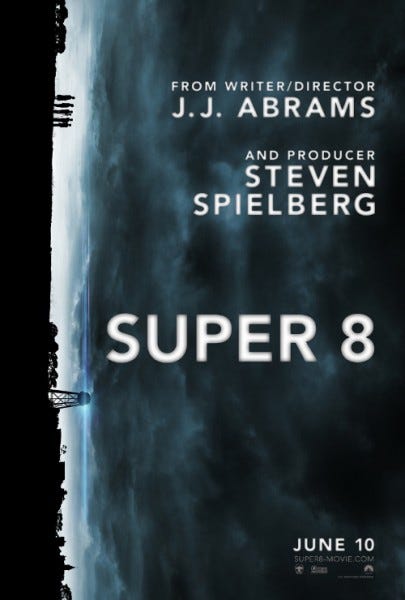
What a ballsy poster. What could have easily been an obvious nod to posters for early Spielberg films is scrapped in favor of this murky, eerie image. It grabs your attention and holds it, forcing you to uncover the poster, and the film's, mystery. Its true stroke of genius is the way it literalizes the fact that the characters' world is turned upside down. And look at that stormy sky! So ominous, so intriguing. But this isn't a simple horror image. As in most Spielbergian spectacles, this film -- and its poster -- strike a perfect balance between danger and wonder.
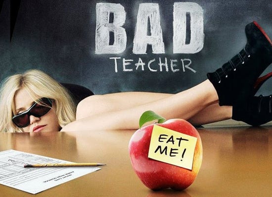
Not a "great" poster, but I like it because, like the film's title, it is charmingly simple and straightforward. What you see is what you get.
And the Worst (in no particular order)...
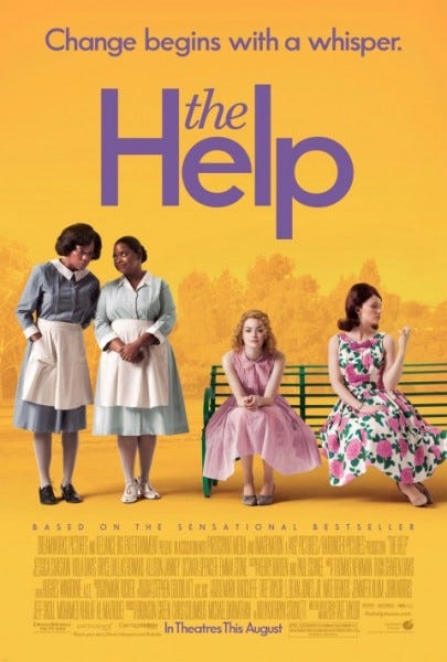
Simply put, this is a boring image. Why not design the poster as a close-up of a maid's uniform? Or a dirty dishrag? Any of those images would be more interesting than this one.
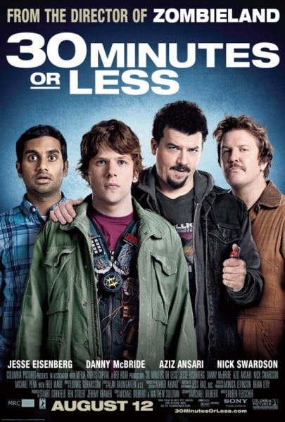
The deer-in-the-headlights expressions worn by Jesse Eisenberg and Aziz Ansari fit perfectly considering their characters face the surprising situation of being forced to rob a bank. However, this poster is lazy and flat. It seems more focused on attracting moviegoers to the film's stars rather than its plot. See "Marketing Breakdown in 30 Minutes or Less" for more.
"Green Lantern"
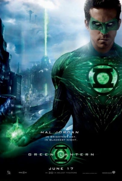
If you are not familiar with Green Lantern as a comic-book character, I suppose this poster would be enticing. But if you are a comic-book fan, this image isn't all that exciting. I felt the film's whole marketing campaign was a bit lazy, depending too much on summer moviegoers' blind loyalty to superhero films.
Well, there you have it. Although this wasn't an exceptional summer for movie posters, it wasn't without a few great ones and some stinkers. Which posters did you love — or loathe? Feel free to comment here and discuss the promotional artwork that caught your eye or got your blood boiling. And stay tuned, as I will shine my magnifying glass on more posters in the weeks to come.


