Marketing Breakdown in 30 Minutes or Less
Welcome to the second entry in the Marketing Breakdown series. Now that I've done my whole spiel about how promotional film artwork isn't what it used to be, it's time to analyze current posters in greater detail.
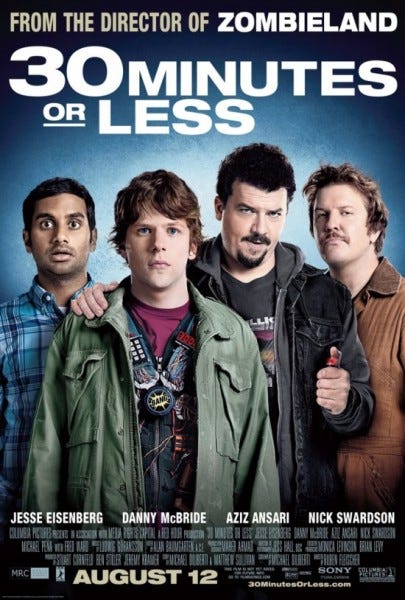
This week, I'm shining my magnifying glass on the poster for the comedy "30 Minutes or Less," which is in theaters now (if you have the stomach to see it after reading our hilariously scathing review).
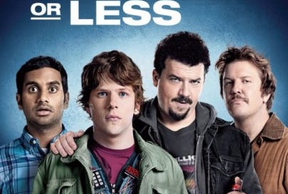
This poster is about as exciting and professional as a quick snapshot taken by your beer-bellied uncle at a backyard barbecue. In other words, it's overly casual and more than a bit lazy. The deer-in-the-headlights expressions worn by Aziz Ansari and Jesse Eisenberg are fitting considering their characters face the surprising situation of being forced to rob a bank. And the misty background could be symbolic of the proverbial fog clouding everyone's judgment in the film. However, this poster doesn't seem focused on attracting viewers to the movie's plot. Instead, like most posters these days, it merely showcases the film's stars.
Here are some ideas for alternative posters. Considering the film is something of an homage to '80s buddy action comedies (e.g. "Lethal Weapon," "48 Hrs."), why not give a nod to those films in the poster? Marketing executives could have also underscored the absurdity of the plot. Since the film follows a pizza-delivery guy (Eisenberg) with a bomb strapped to his chest, the poster could have been designed as a pizza topped with explosives, with the characters' heads in place of the pepperoni. Doesn't that sound fun? Or ... here's a crazy thought marketing execs never seem to consider: How about ... no shots of the actors at all? Gasp! Why must all Hollywood films depend on the familiarity and weight of their casts? Well, that's a different question altogether actually.
Most posters for comedies are pretty bland, their images laying flat on the canvas. They rarely, if ever, show the characters engaging in funny acts. For example, check out the poster for "Horrible Bosses." Sure, the characters' expressions are amusing, but the poster is passive. To make it more active, and thus more visually appealing, it could have shown the characters in the act of killing their bosses, which is, of course, the film's major comedic set piece. Or ... making good on my plea for the exclusion of actors, the poster could have been designed in the form of a crudely drawn assassination plan. In that case, the title "Horrible Bosses" would have been a sufficient explanation or summary of the film's plot. The star's faces wouldn't be necessary for the purpose of enticing moviegoers.
Basically, in a nutshell, marketing executives need to take more risks. Here are some posters that took those risks ...
"The Dark Knight Rises"
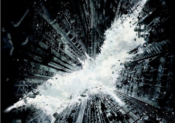
On Tuesday, July 12, the teaser poster was revealed for the most anticipated film of 2012, "The Dark Knight Rises." The Internet was probably flooded with traffic and rightly so. This stark image of a crumbling Gotham City is undoubtedly captivating.
Not only does this poster have a beautiful, handmade quality and grittiness, but it's imbued with a sense of mystery. None of the stars are included and the image is pretty ambiguous. It also reflects the goal of the Batman franchise. In the poster, Gotham City looks as if it is being prepped for reconstruction, like the film series itself and the comic-book genre in general.
The new direction of the Batman series — its grounding in gritty reality — was evident in the poster for 2008's "The Dark Knight" as well. The tagline, "Why so serious?," seemed to be an announcement of the film's dark tone and a reflection of the possible criticisms regarding it. These posters do exactly what all should do — reflect the intentions behind, and attitude of, the film.
"Rise of the Planet of the Apes"
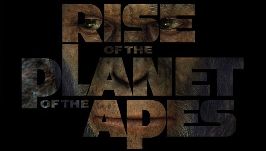
This simple, unsettling image perfectly summarizes the film. The movie's tone is evident in the ape's cold, fiercely focused eyes. And the central figure and title is initially difficult to see, which draws you closer to the poster and makes it all the more eerie. At once murky, ambiguous and perfectly clear, this is the summer's riskiest — and therefore most effective — poster.
That's just a taste. Stay tuned, as I will count down the best and worst posters of the summer in the weeks to come.


